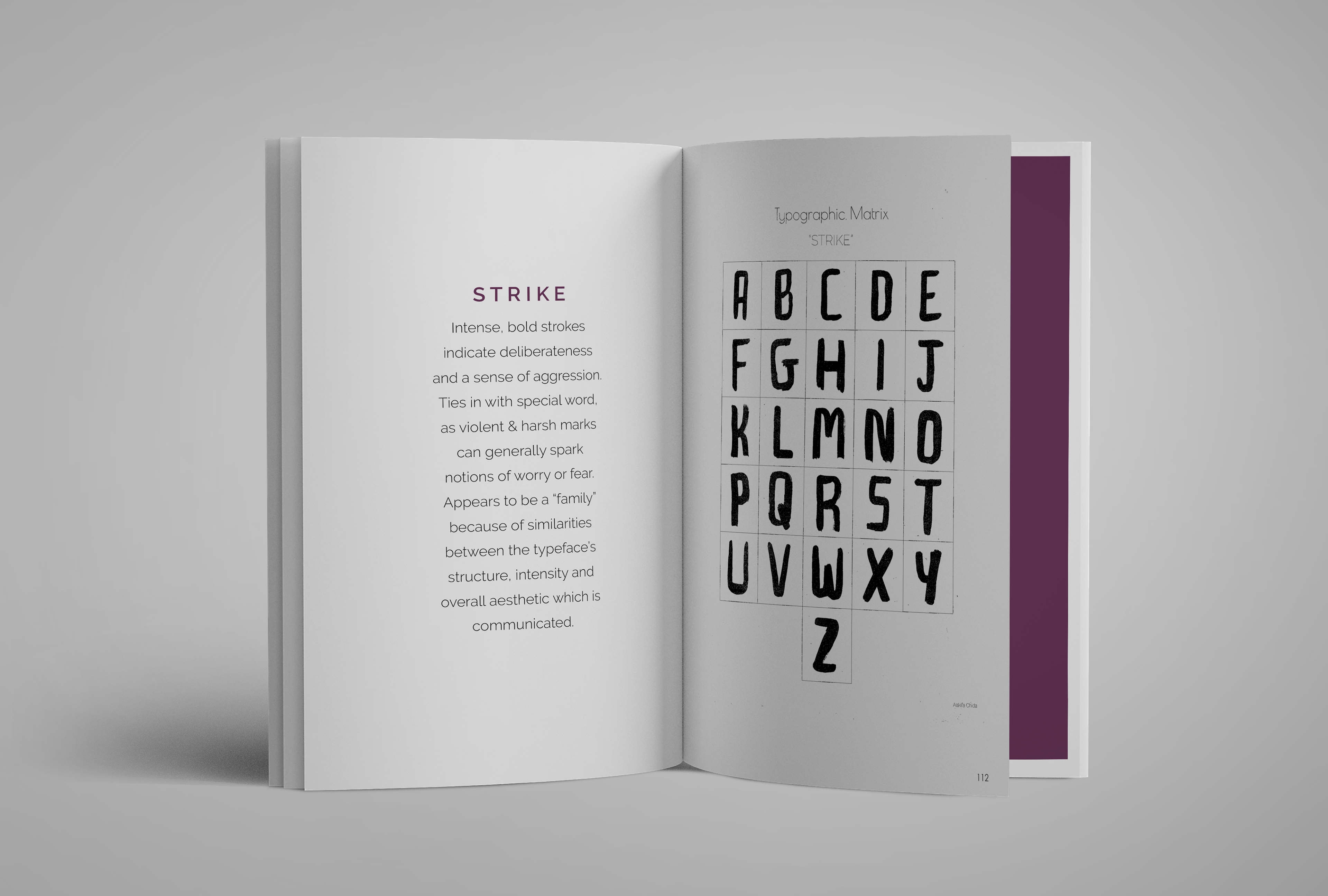
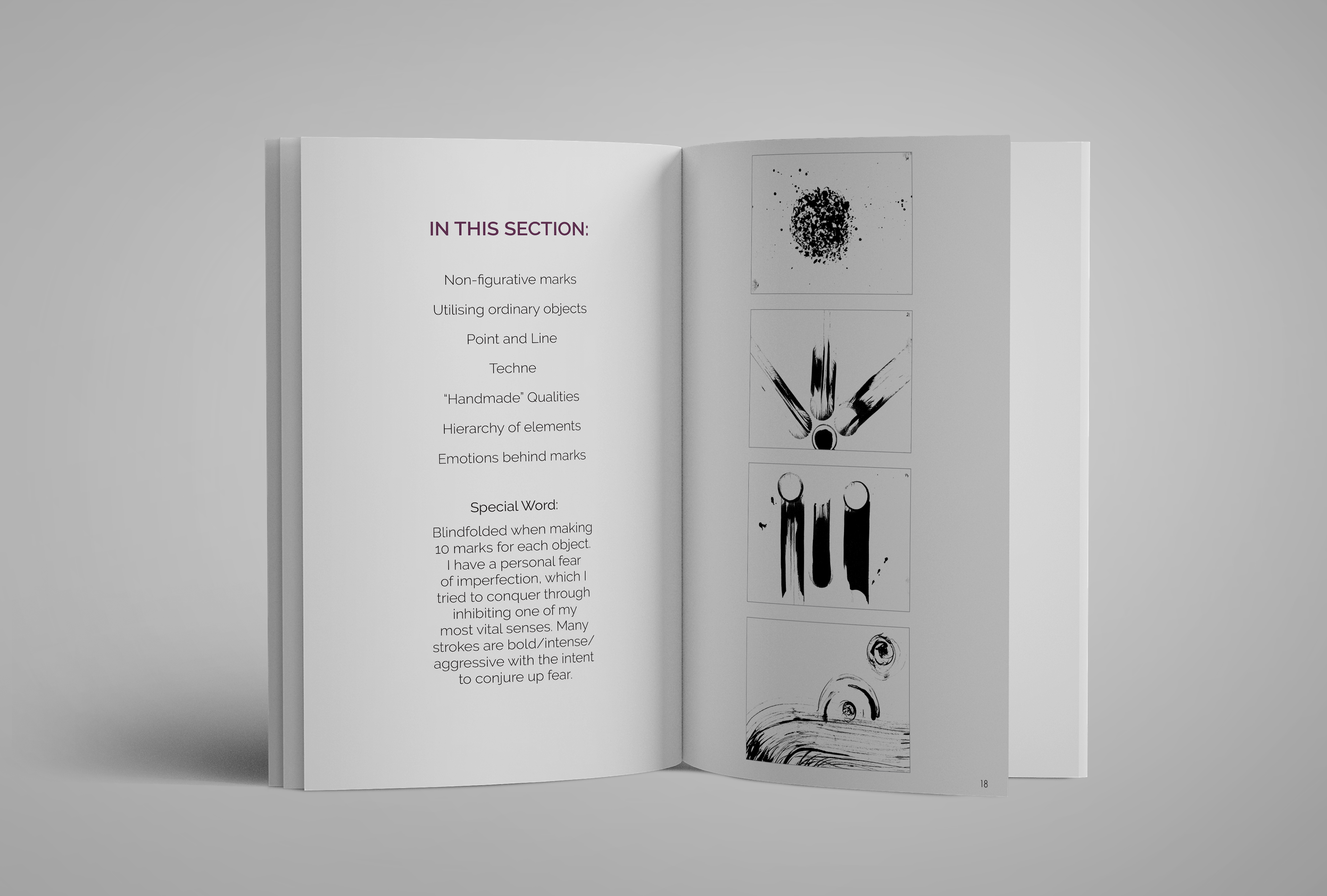
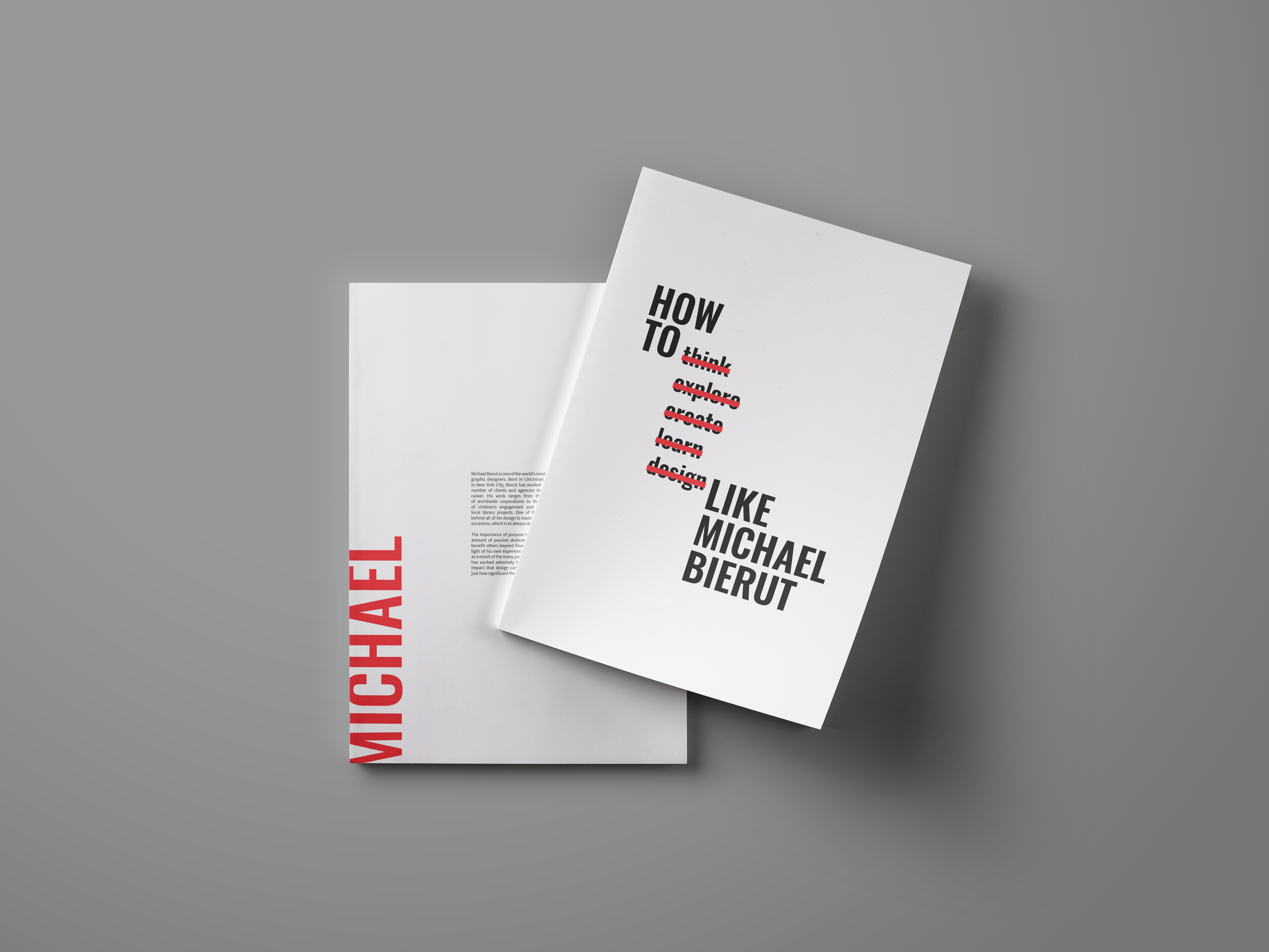
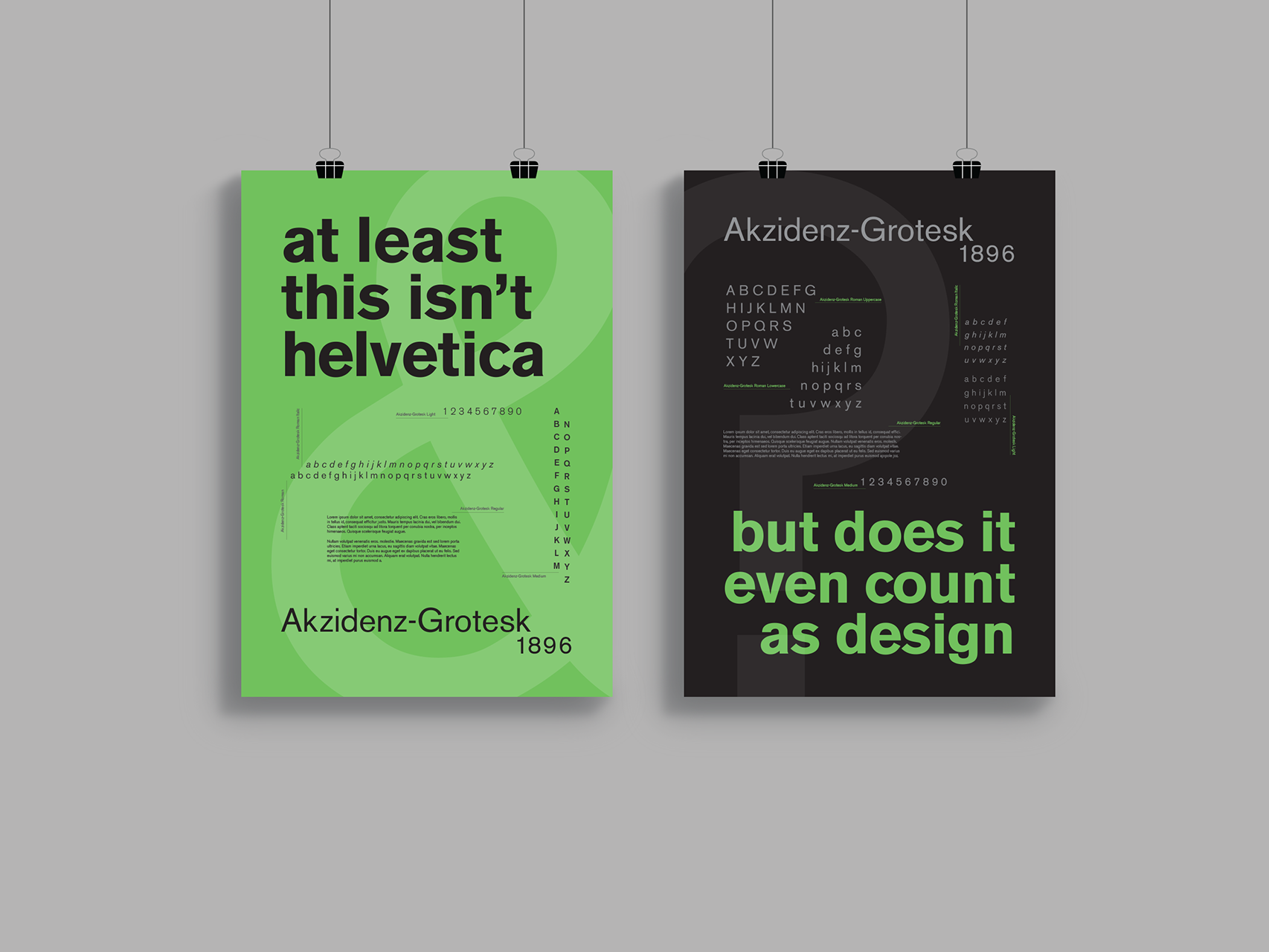
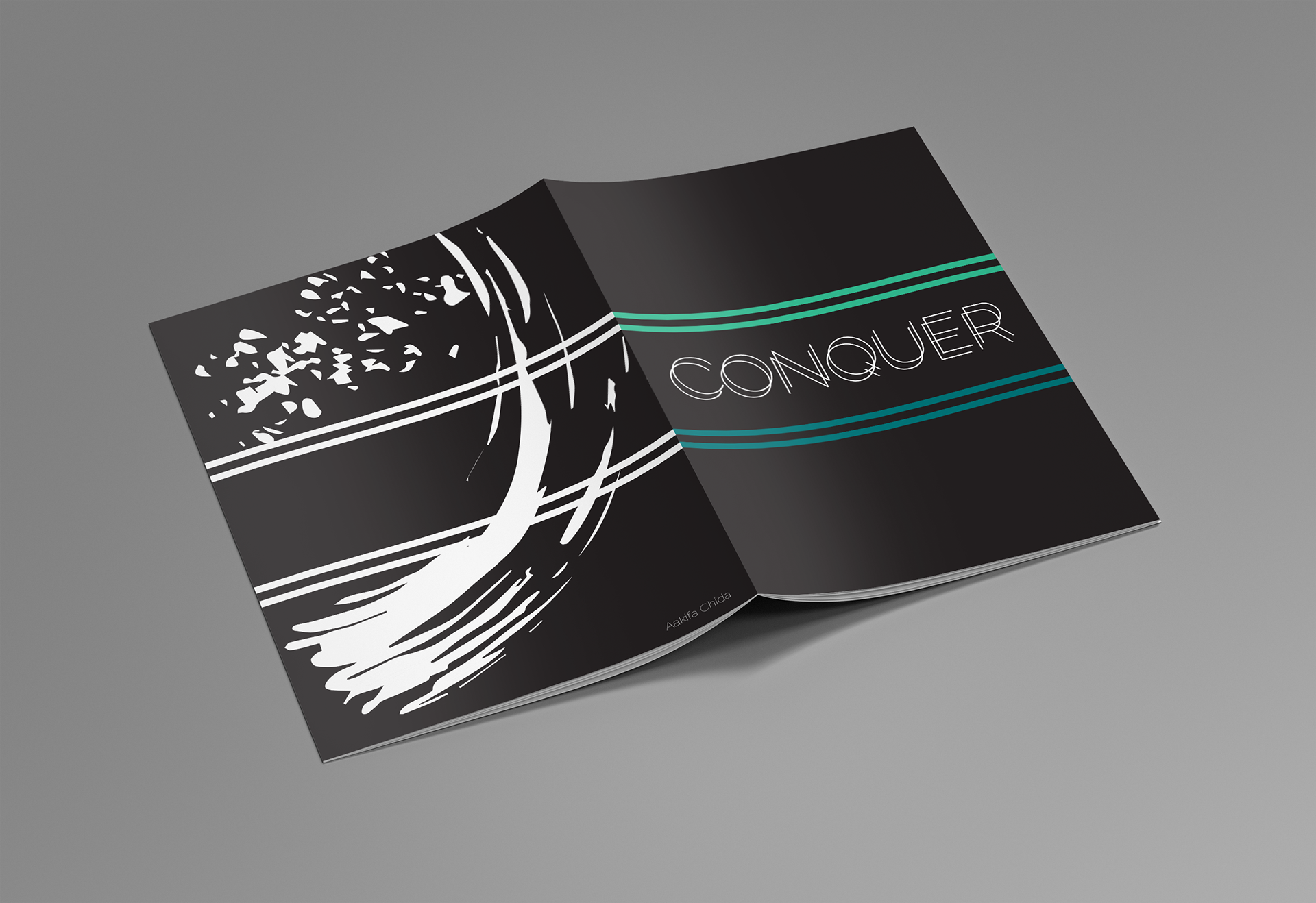
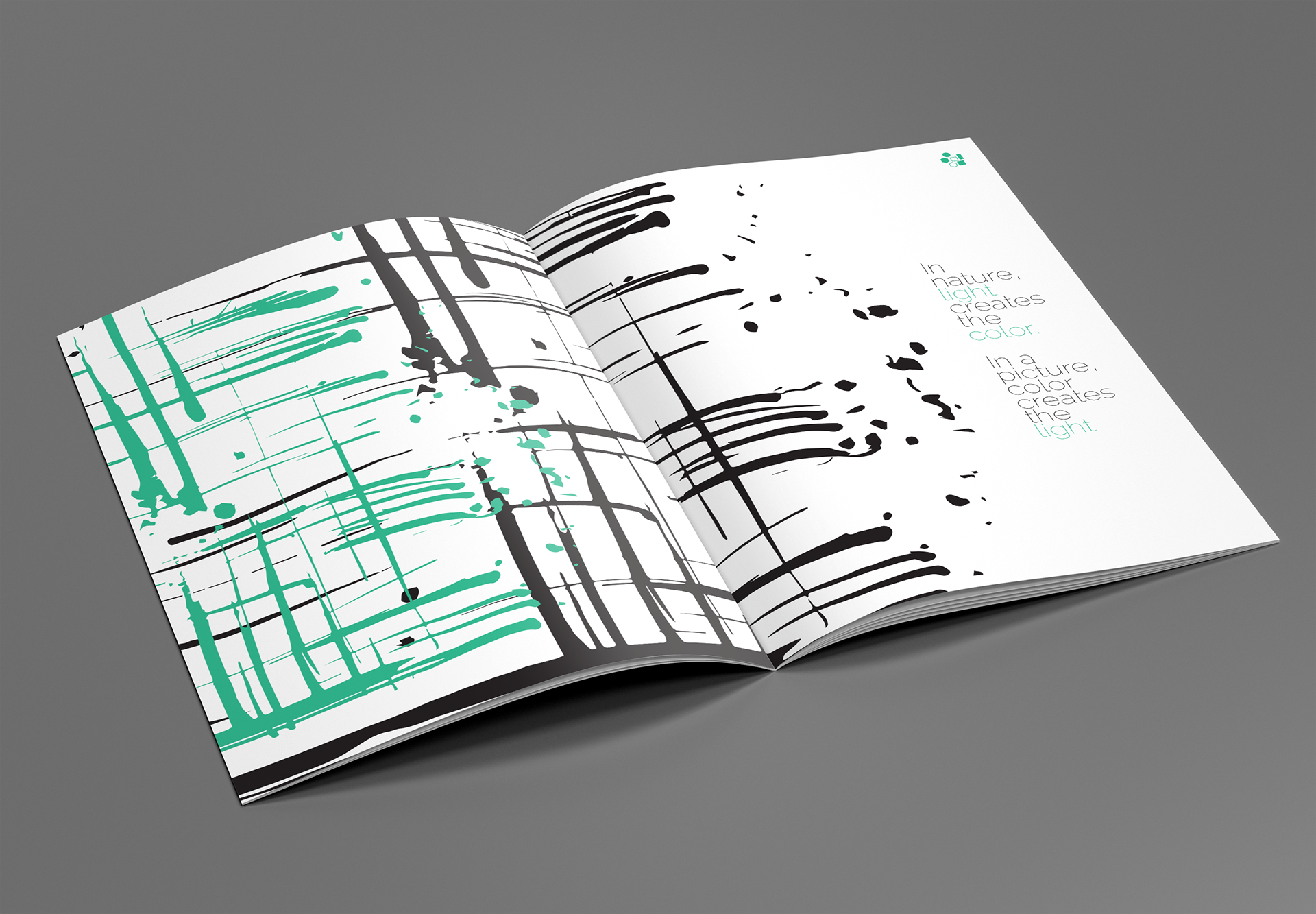
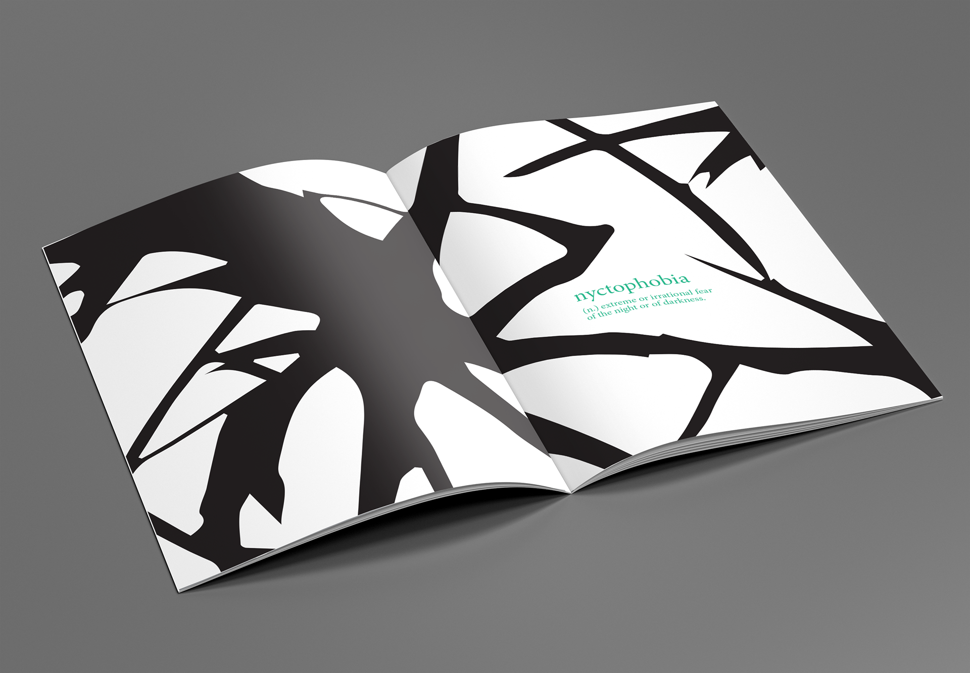
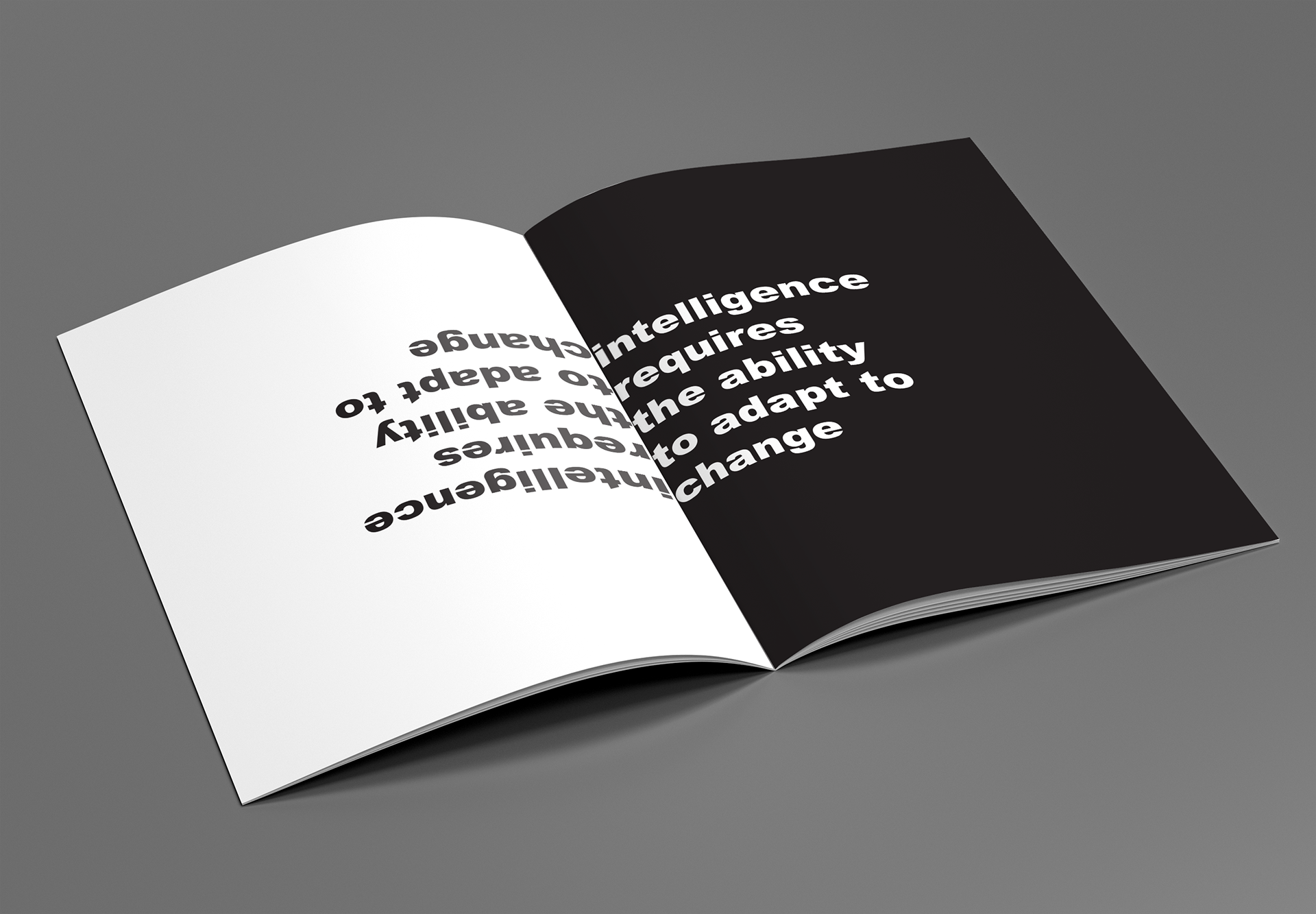
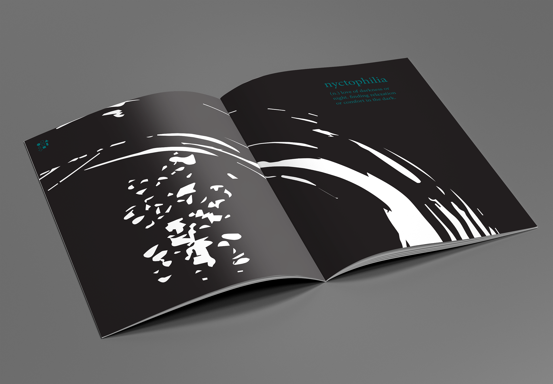
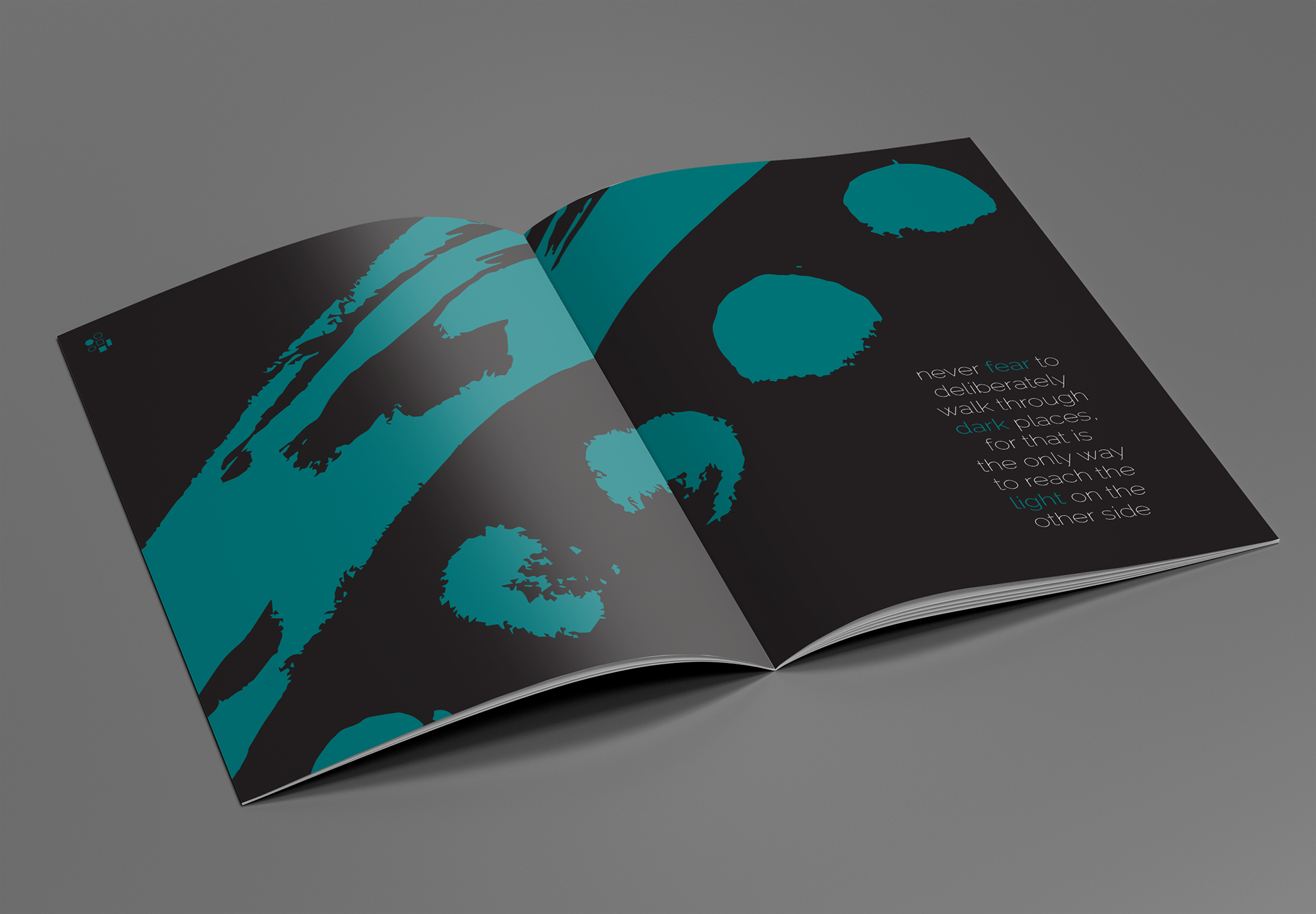
The first project at University was a publication consisting of graphic elements, typography, and abstract mark-making which all relate to the thematic word allocated to each student. My publication's core word was "fearless" - therefore I explored the journey from nyctophobia and nyctophilia through strong contrasts and visible tonal progression. I chose to restrict my colour palette so that the black and white contrast was noticeable, as it is the primary visual tool that carries the message.
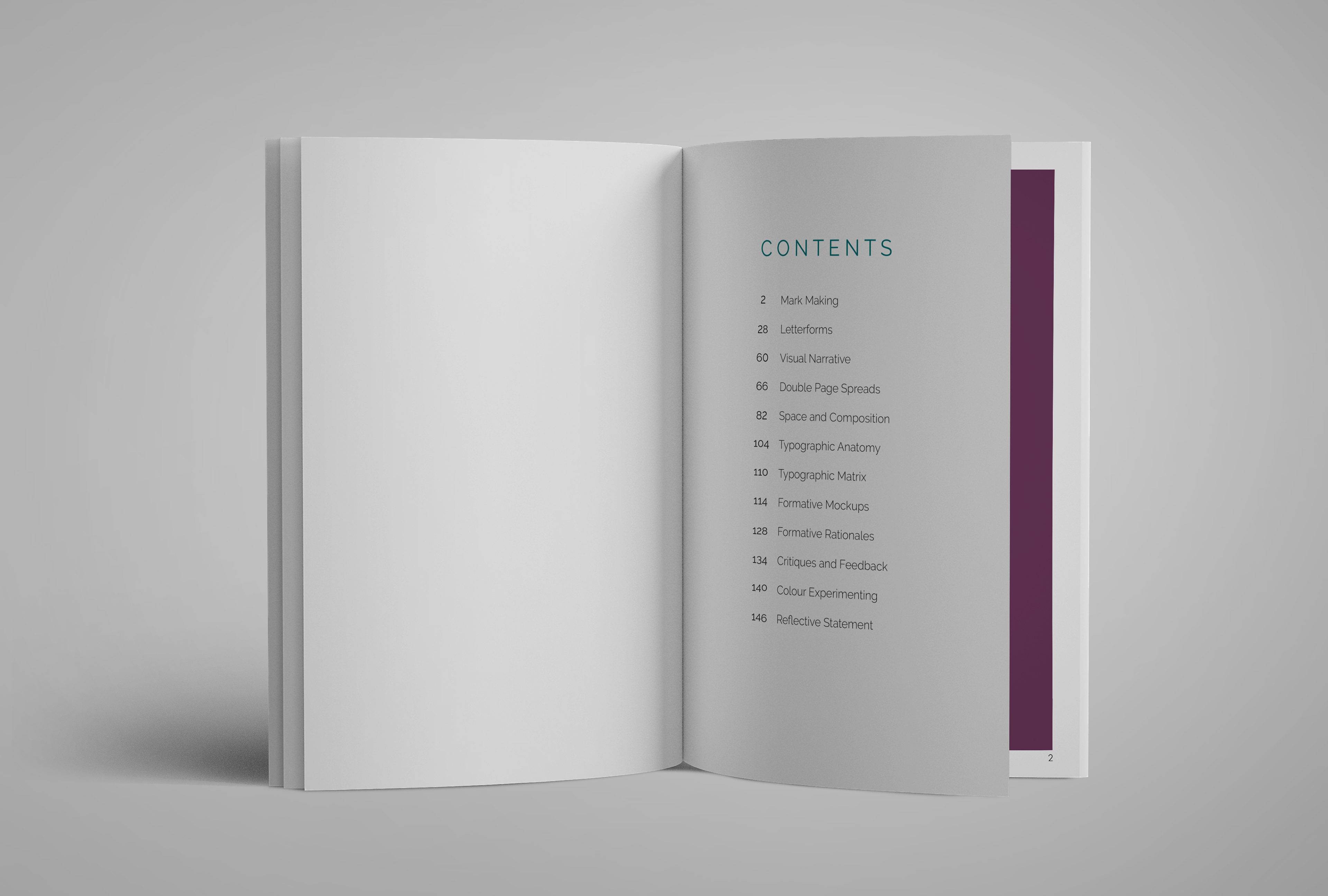
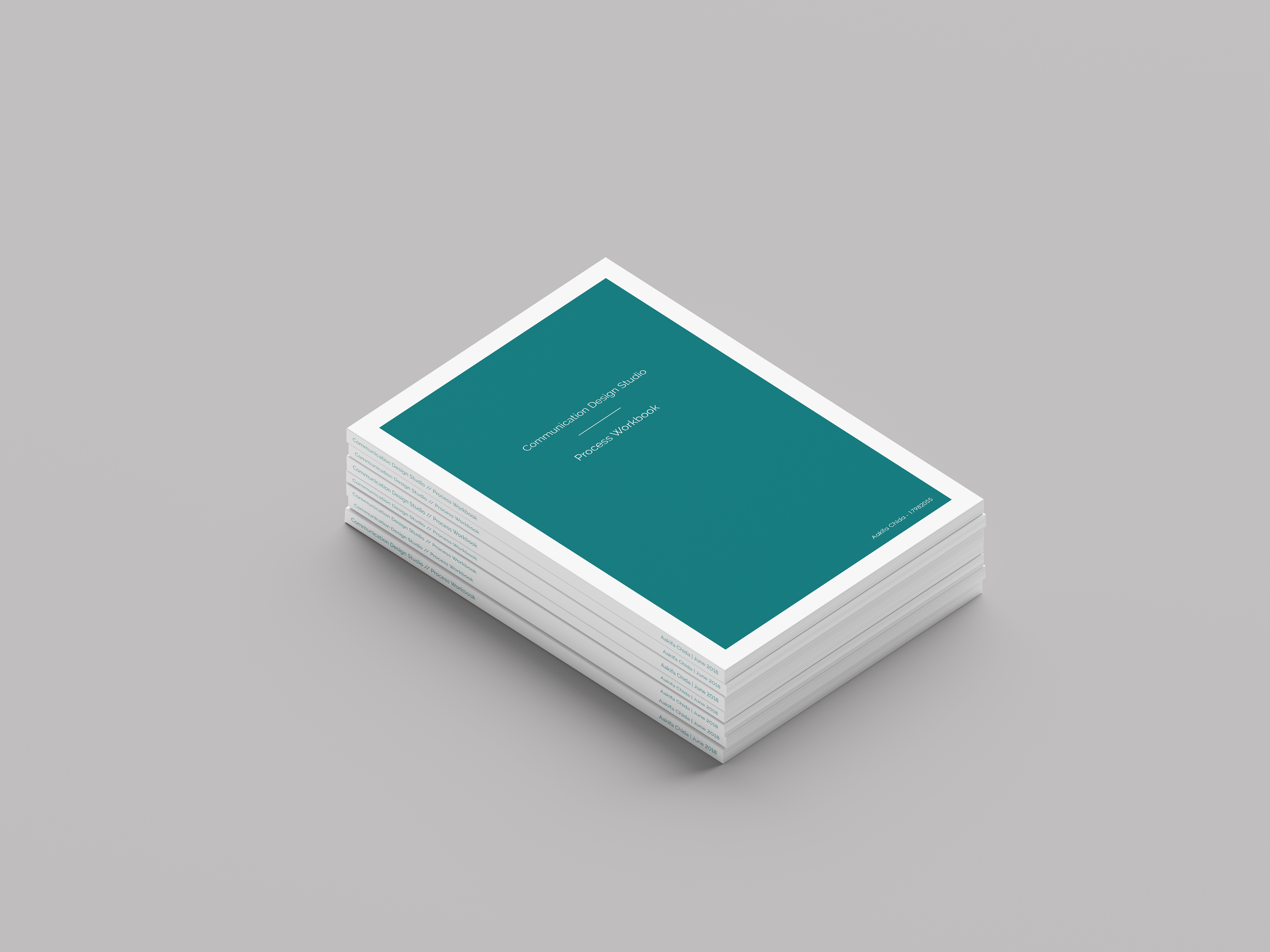
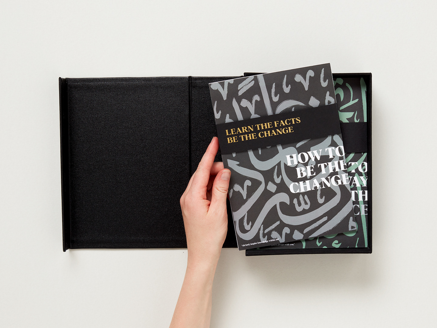
The main A5 publication itself was printed, bound, and handed in along with two A3 foldouts defining the two opposite ends of the fear being communicated. This was also submitted with a 150+ page workbook which I designed, printed, and bound myself.
The summative deliverables were handed in with two stages of formative publications along with three 200-word rationales reflecting different stages of the creative process.
Markmaking/ Publication/ Graphic/ Layout/ Type
- P U B L I C A T I O N -
- P R O C E S S -