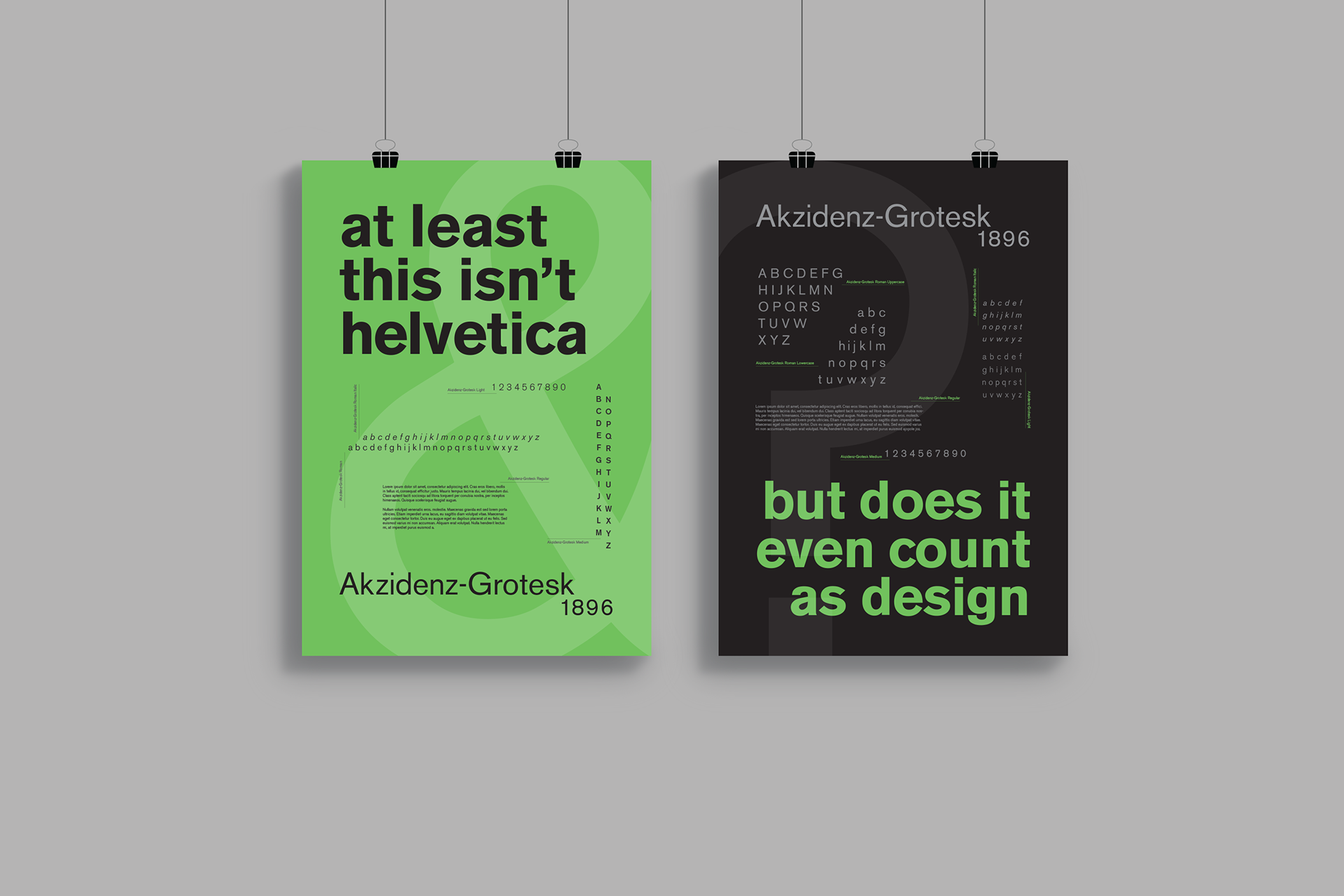
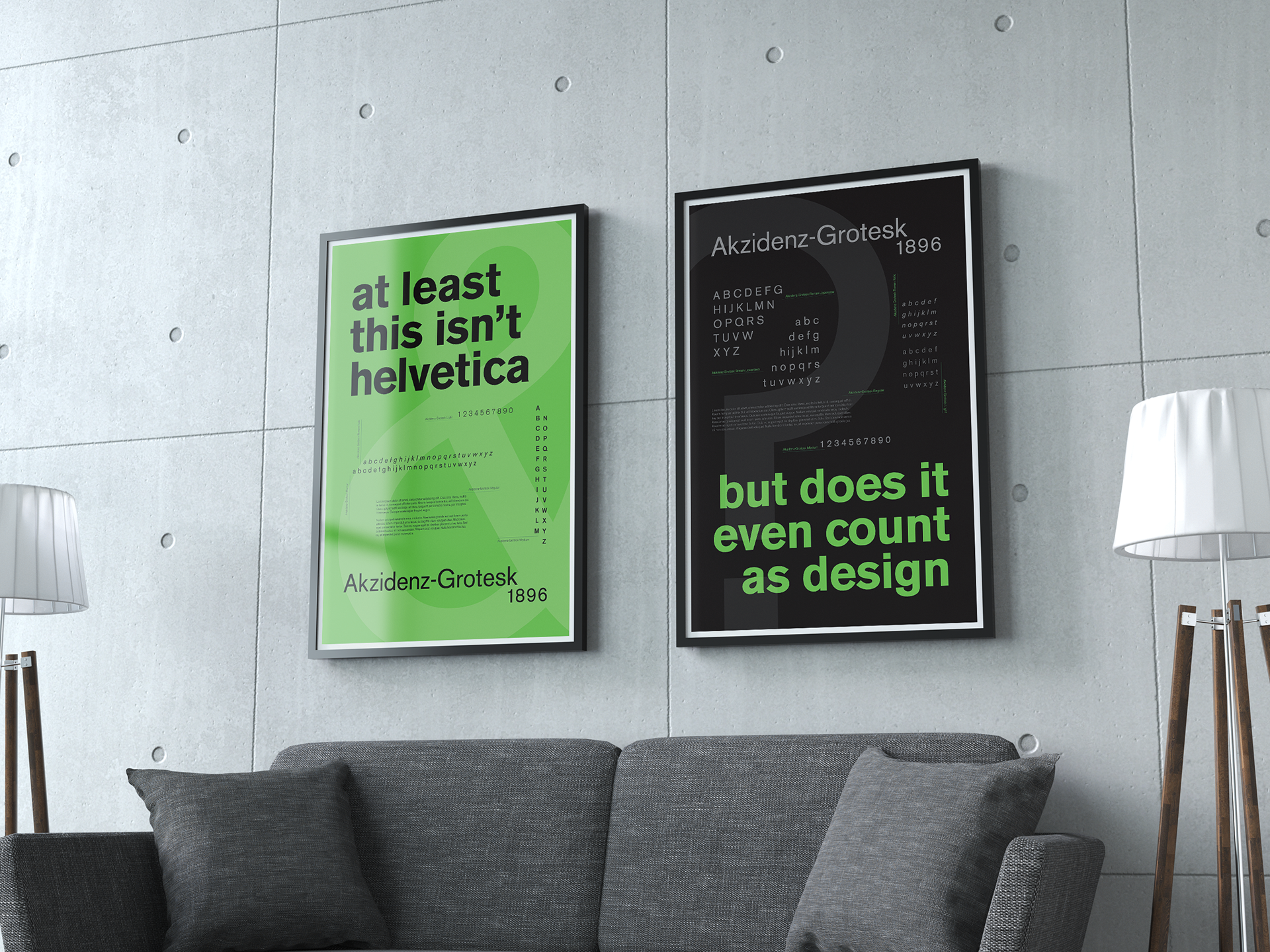
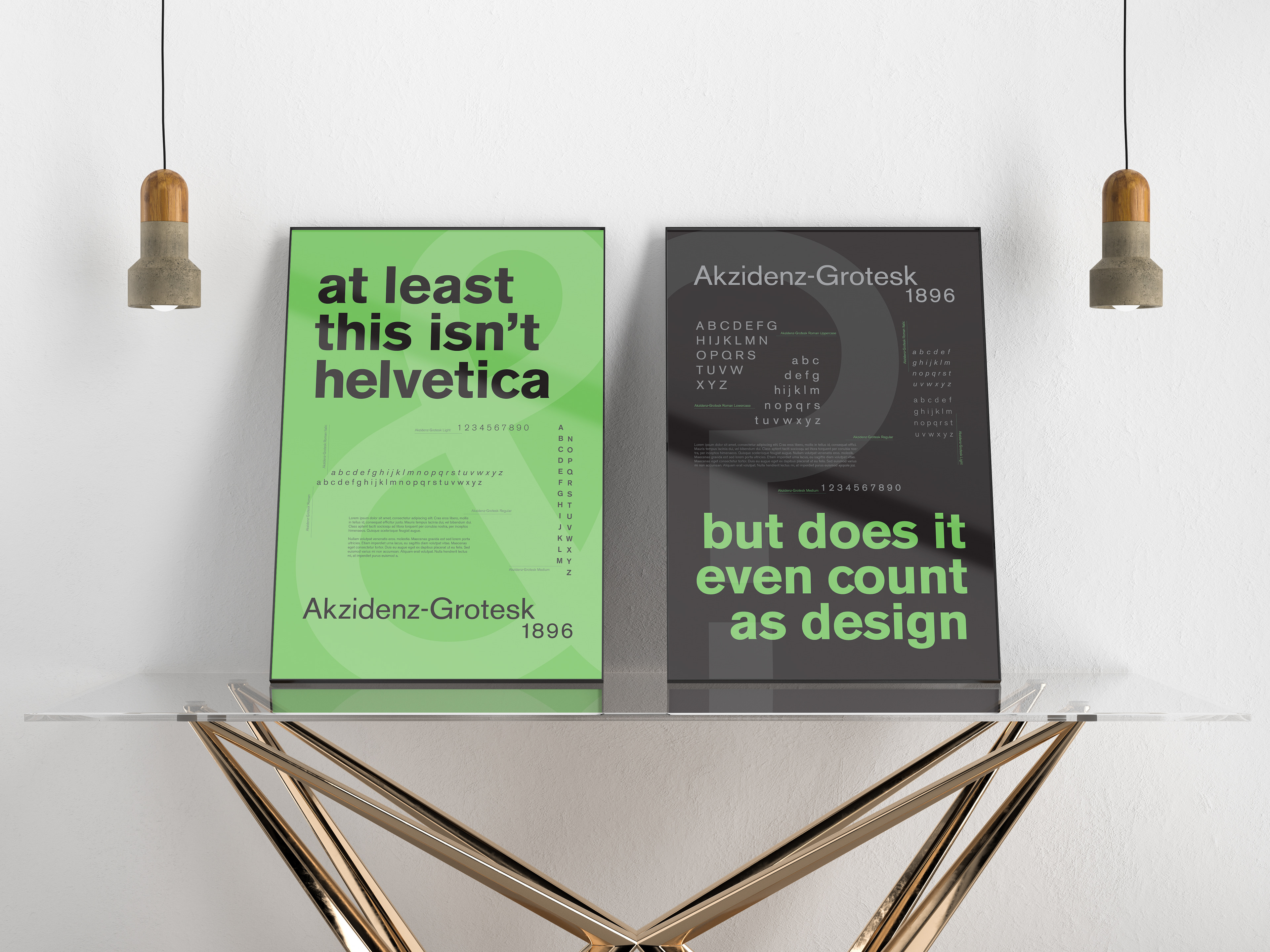
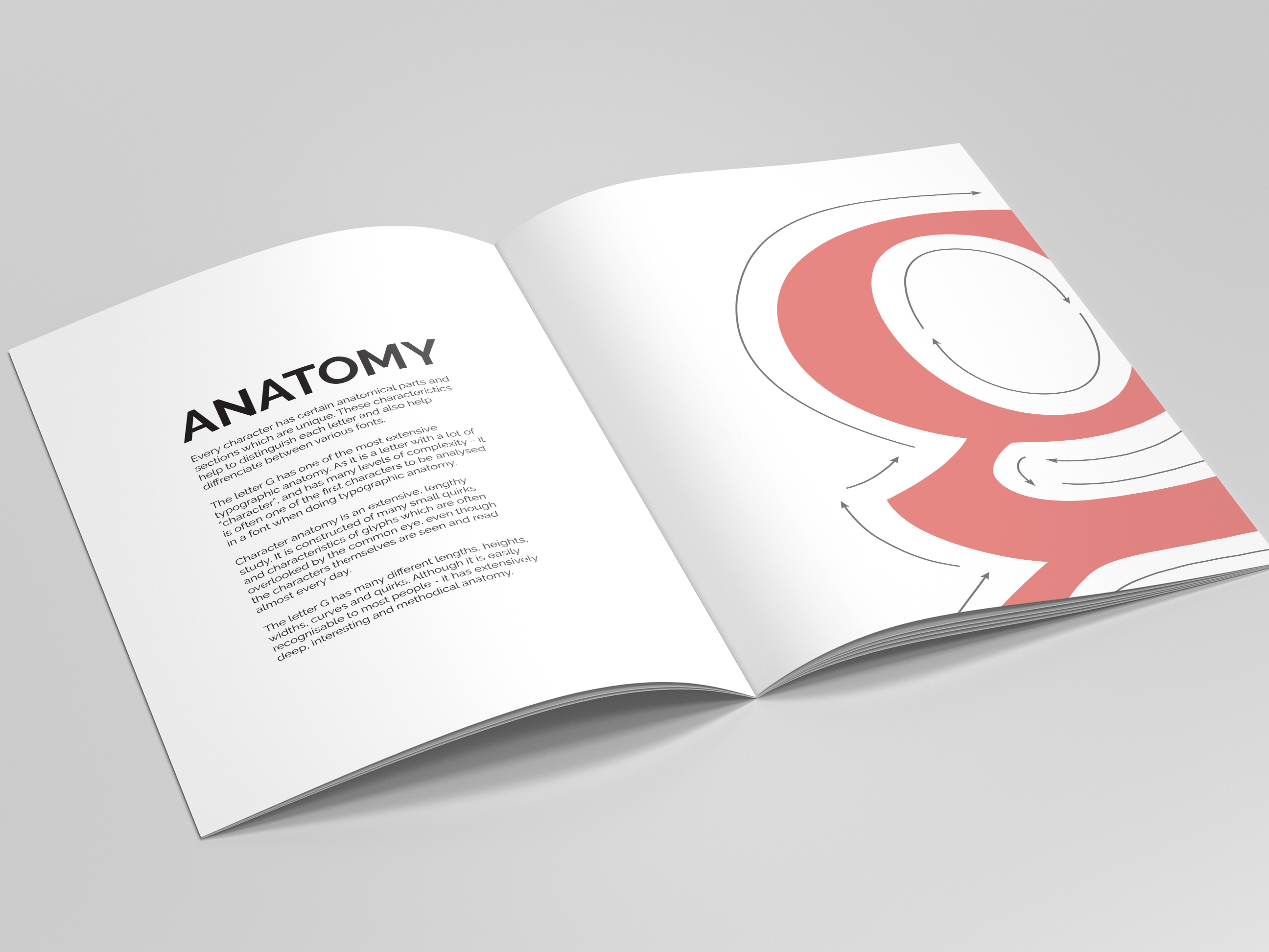
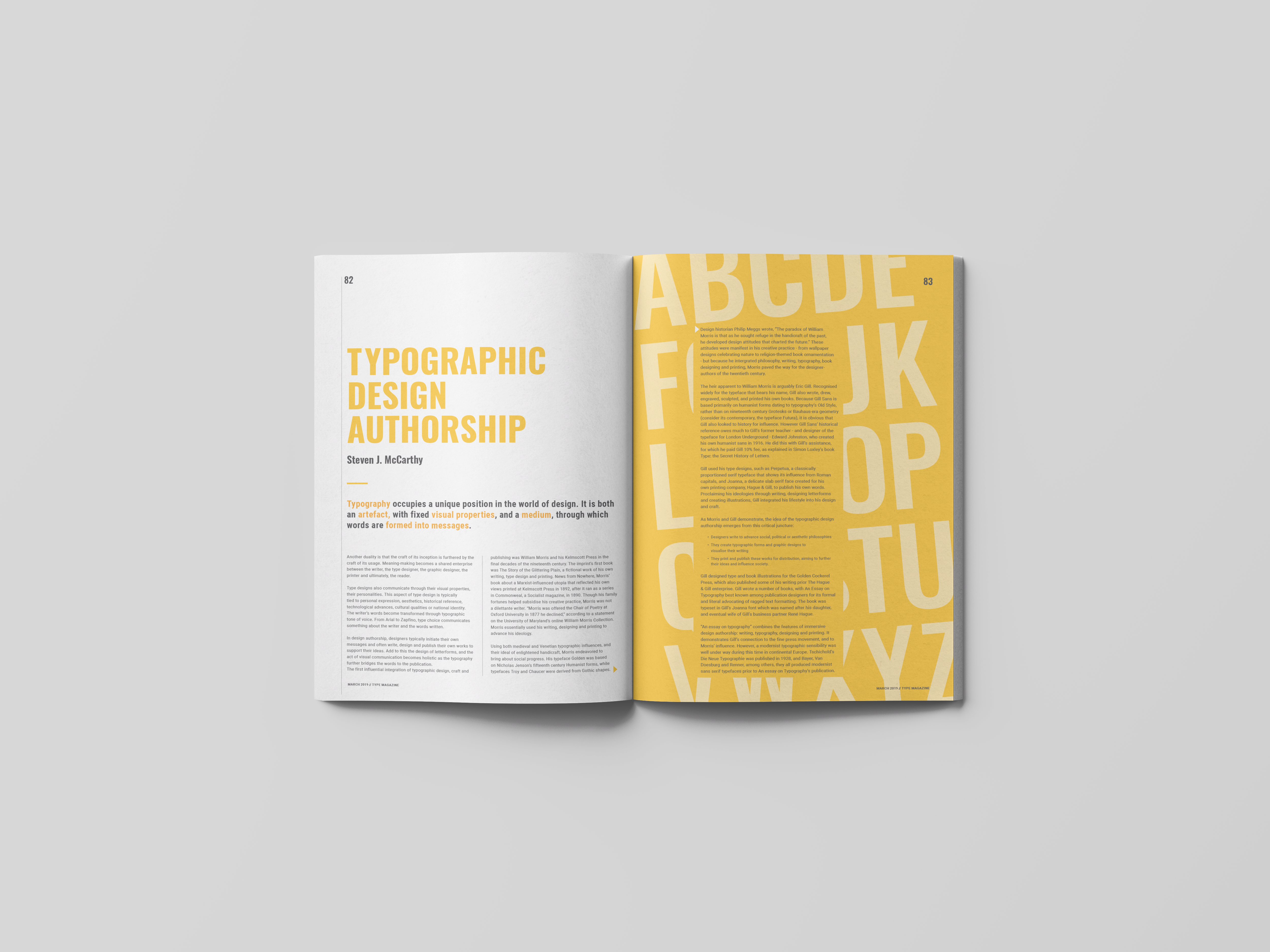
The aim of our first 2019 project was to create type specimens - posters that showcases the ins and outs of a typeface. We had the opportunity to choose any typeface, and three weeks to develop two A1 posters.
I chose Akzidenz Grotesk, a sans serif typeface that was originally released by the Berthold Type Foundry in Berlin (1898). This typeface is generally used for commercial or publicity purposes as opposed to fine print. This typeface is classified as a grotesque font, as unadorned sans serif fonts were commonly used in Europe during the late 19th century.
The final posters presented the name of the chosen typeface, the year it was designed, a full character set including numbers, and paragraph-formatted text showing various weights within the font family.
Type/ Specimen/ Poster/ Hierarchy/