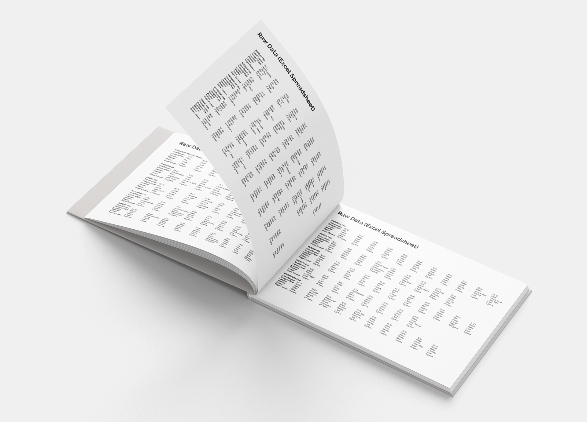
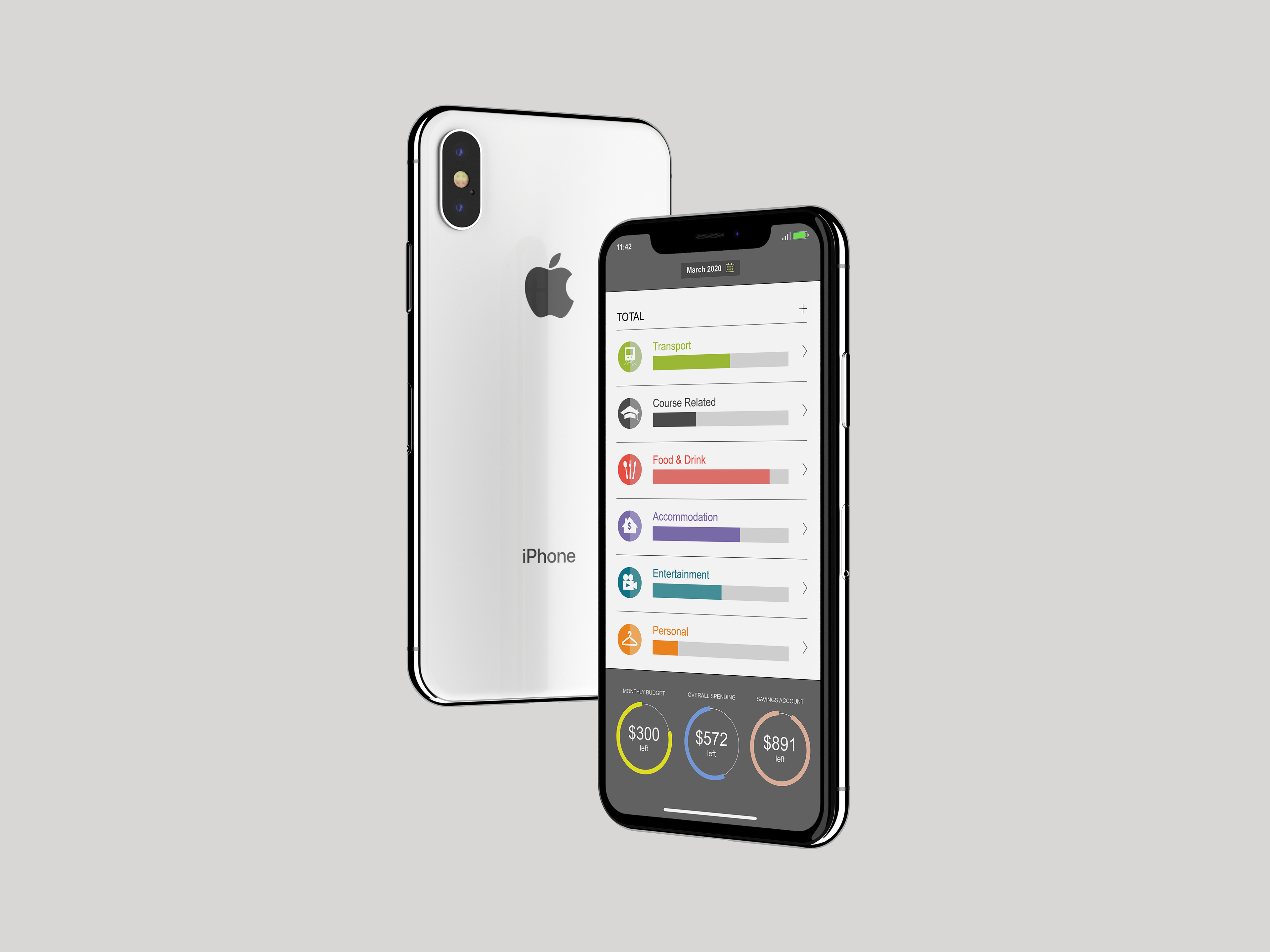
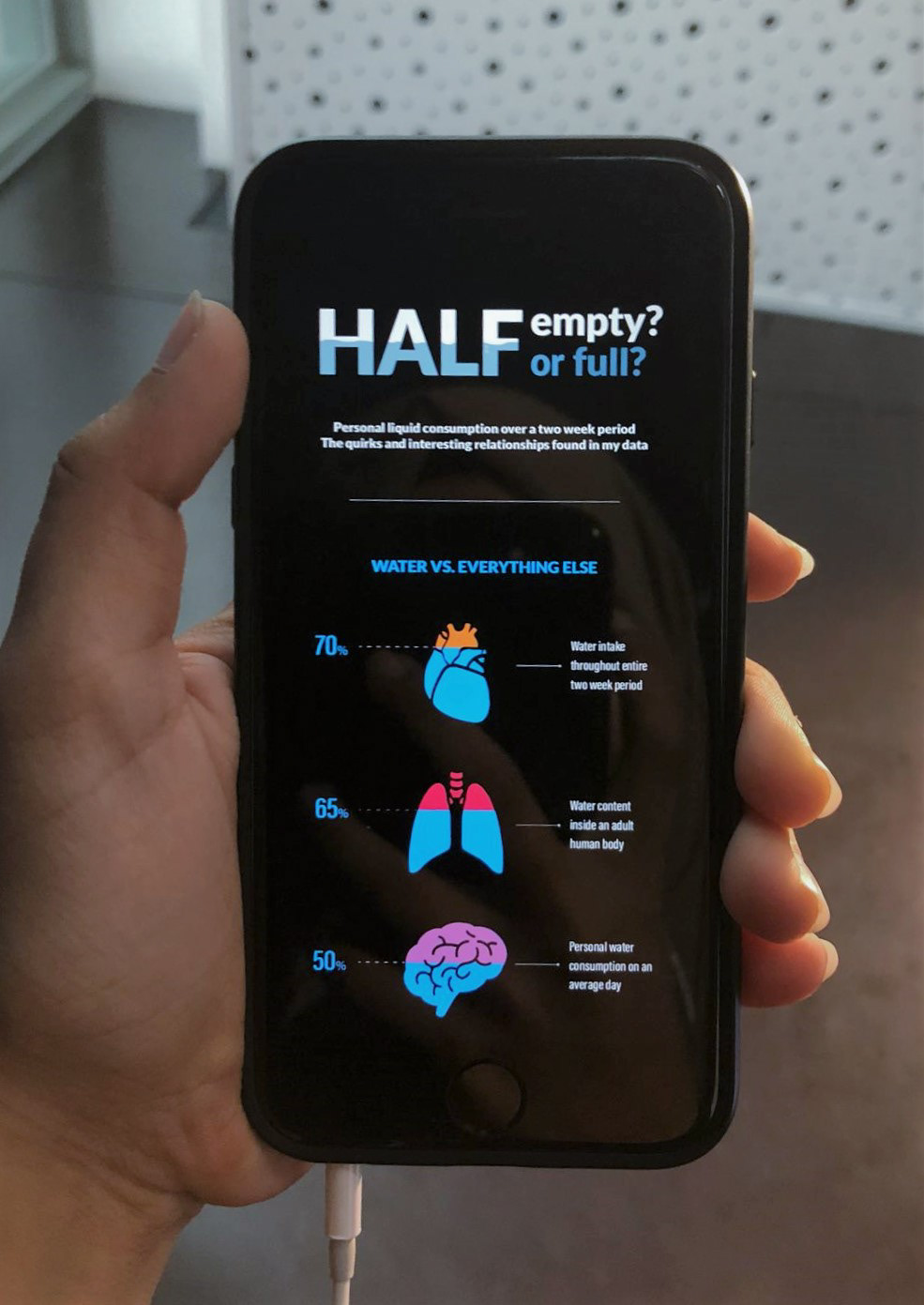
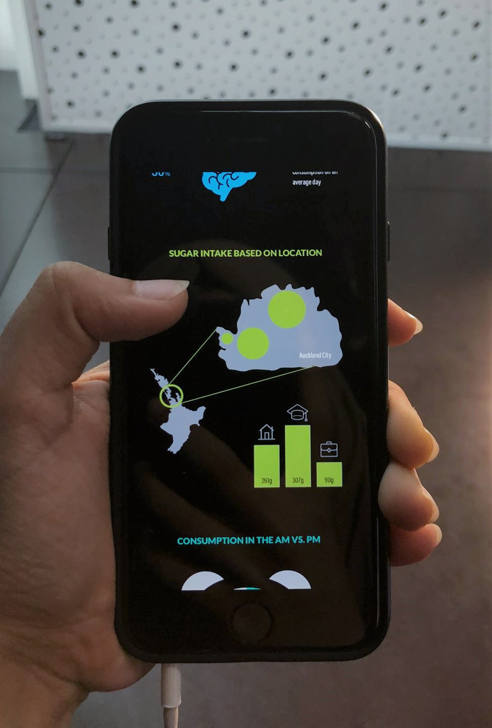
This project aimed to track my personal liquid consumption over a two-week period. The combined aspects of graphs, illustrations, iconography, colour, and typography showed the interesting relationships and quirks found in my data.
The requirement was to use a minimum of four types of data visualisation, and for the infographic itself to be a scrollable image on a mobile device submitted with a process workbook. My aim was to keep the colour palette and graphic elements minimalistic so that the information was easy to understand and read.
Information/ Data Visualisation/ Iconography/ Layout
- PROCESS WORKBOOK -