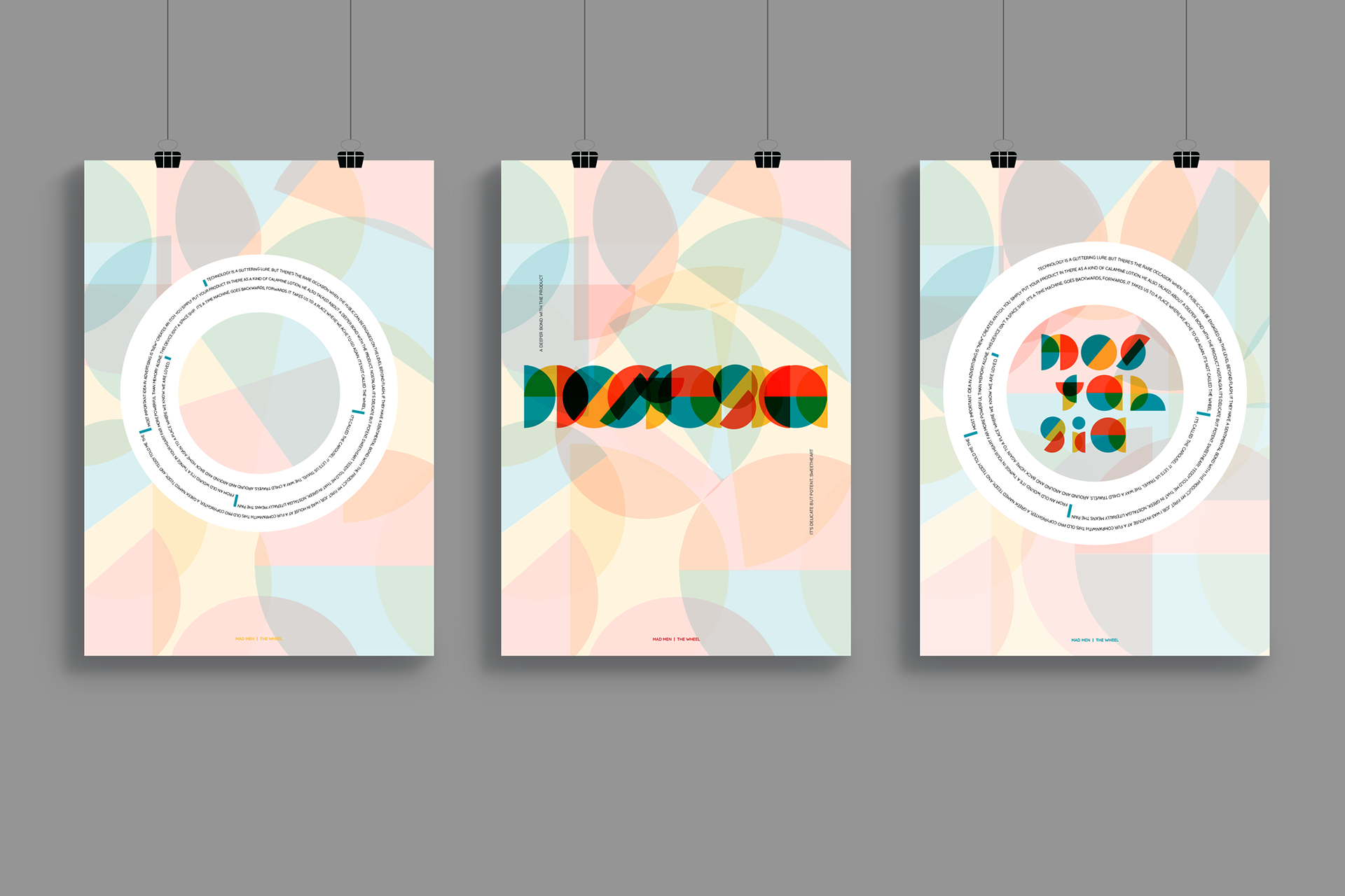
For this brief, the aim was to take a famous monologue from a film/tv show and typographically translate it into a poster. All 3 posters were designed and printed with an accompanying workbook in 3 weeks.
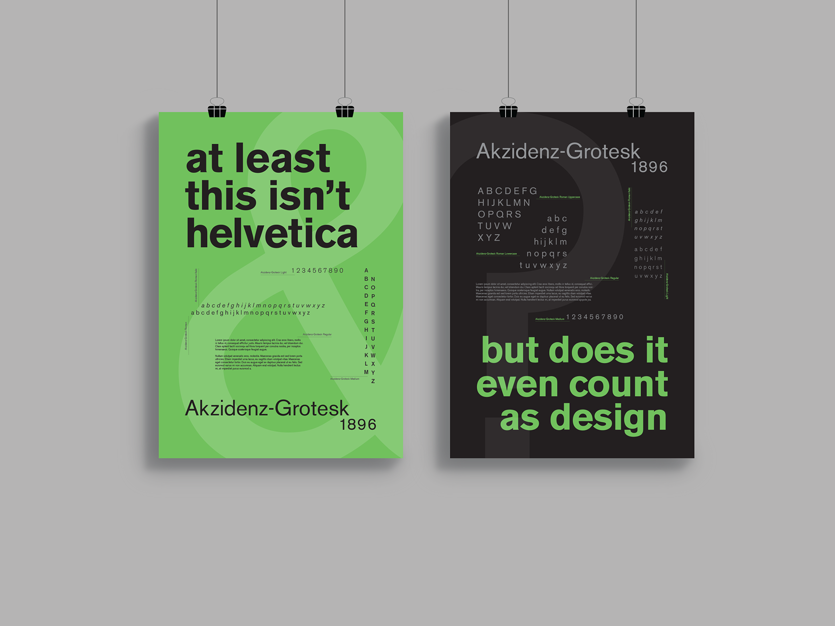
The first poster was “type as text” - to show the entire monologue in a manner that is engaging, readable, and accessible - considering hierarchy, size, grid, font, spacing, and other technical aspects. The second poster was “type as image” - to show the monologue in a manner that is not necessarily readable, but through imagery that communicates the emotions behind the words. The final poster was “type as text + image” - in which the aim was to combine the methods used in the first and second posters to produce a visually expressive as well as readable typographic lockup of the monologue. In this poster, the meaning of the monologue should be evident by how the text looks as well as how it reads.
I chose an excerpt from the TV show “Mad Men”, which was delivered as a business pitch about the new Kodak projector - the carousel. This monologue was about nostalgia and the ability to relive childhood memories. I chose the primary colors as my palette, as they are the building blocks of colour - similar to how our memories as kids are the building blocks for our future experiences as adults. To symbolise the emotions behind the character’s monologue, I chose simple and familiar shapes throughout the series - also symbolising the closure which is experienced when someone is able to revisit fond memories.
I chose an excerpt from the TV show “Mad Men”, which was delivered as a business pitch about the new Kodak projector - the carousel. This monologue was about nostalgia and the ability to relive childhood memories. I chose the primary colors as my palette, as they are the building blocks of colour - similar to how our memories as kids are the building blocks for our future experiences as adults. To symbolise the emotions behind the character’s monologue, I chose simple and familiar shapes throughout the series - also symbolising the closure which is experienced when someone is able to revisit fond memories.
Type/ Monologue/ Imagery/ Communication